Typographic Calendar //
The Problem →
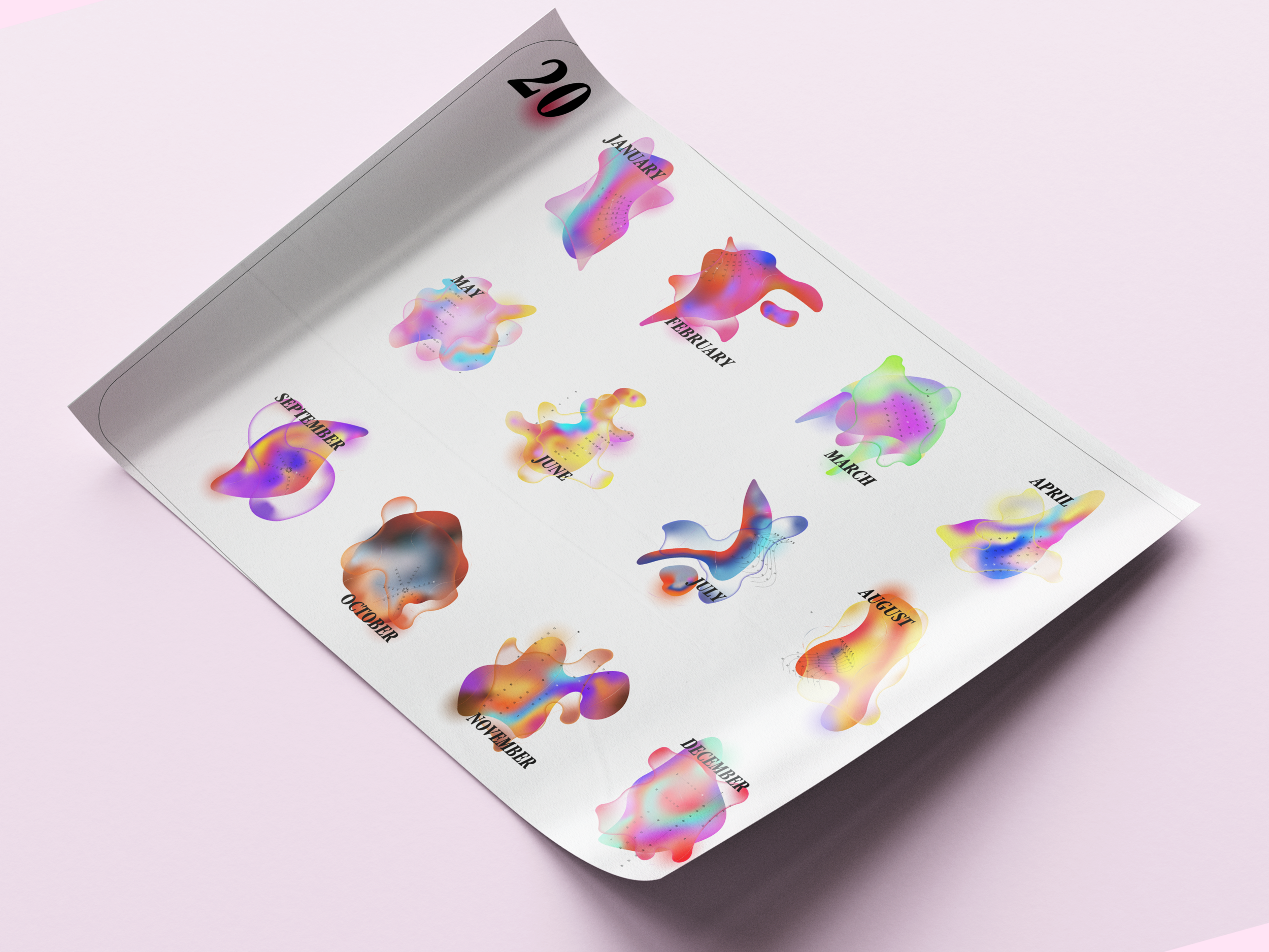
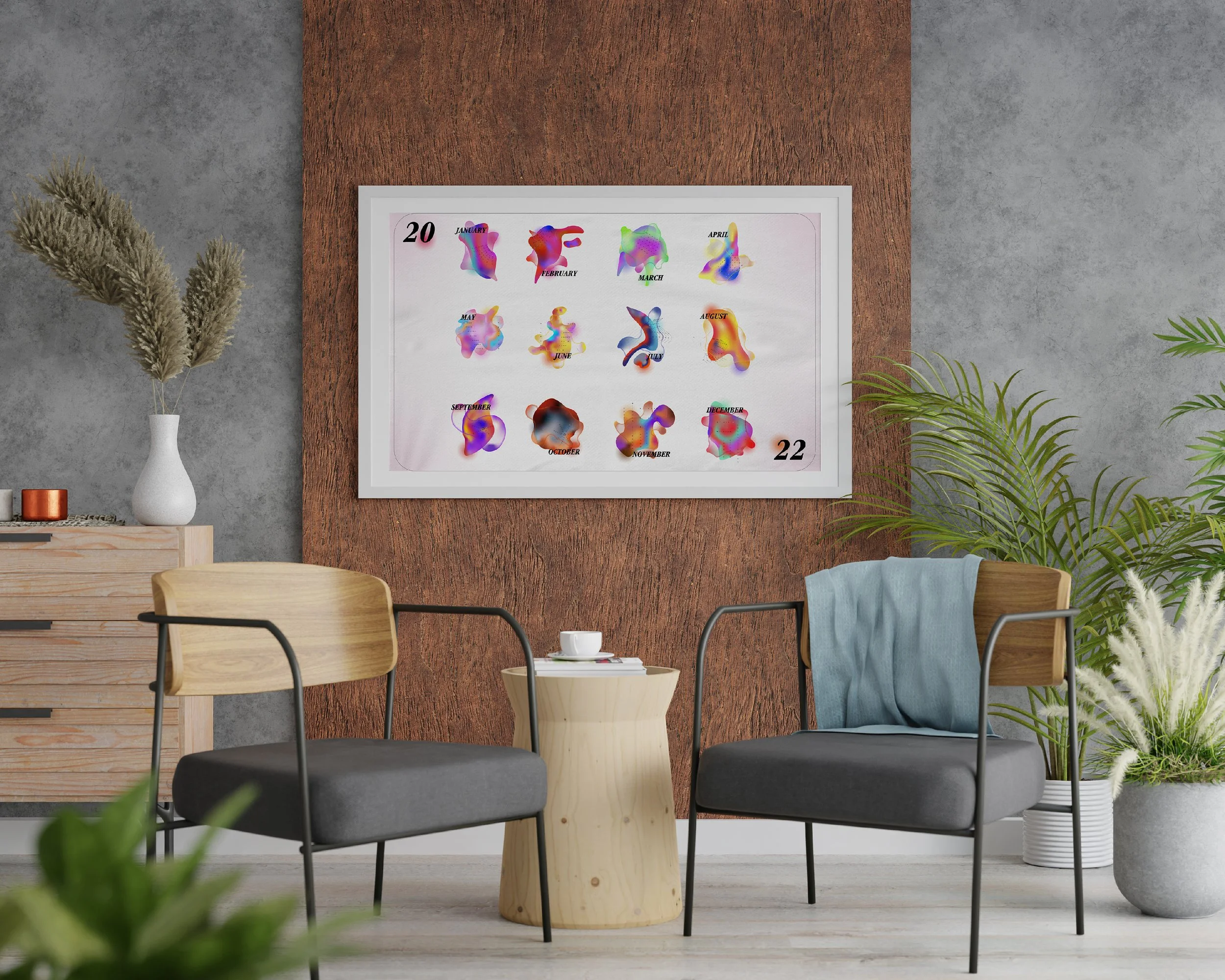
For this project, I was asked with making an annual calendar that doesn’t follow the square-oriented tradition. The goal of the calendar was to make a “template” that prioritized aesthetic over function. I decided to make extremely abstract shapes that loosely represent the first letter that corresponds with the month (“O” in October). In addition, the colors chosen for the textured gradient are based on seasons/holiday colors that are within the month!